Patrik Sandberg has made a name for himself in fashion as editor of titles like V, V Man, and Dazed. Last August he joined CR Men as its editorial and creative director, overseeing a rebrand of the publication. Earlier this month it was announced that he has been promoted to creative director of both CR Men and CR Fashion Book. Ahead of new issues of both tomes hitting newsstands on March 5, The Daily caught up with Sandberg to find out the thinking behind CR’s new logo, and his vision for CR Men.
Let’s start with CR Men — how did that rebranding come about? What did you guys have in mind?
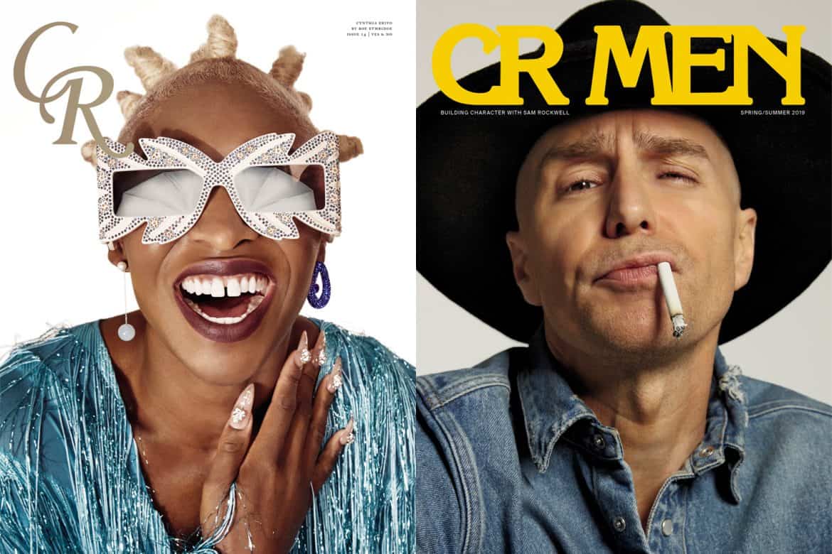
The issue with LaKeith Stanfield on the cover was my first issue. The actual cover design for CR Men came from Carine wanting to reference Hustler Magazine actually! She was like, “This is an iconic logo even though it’s very plain and I like the way that this is laid out.” We sort of based the geometry in a sense on Hustler, this big title across the top with the smaller headlines underneath. I am very obsessed with design and I already knew who I wanted to work with. I reached out to this designer named Aaron Lowell Denton. He’s really well known in the music world. He does a lot of album covers and tour concert posters and things of that nature. We sent some stuff back and forth…the team was so happy with him that they actually hired him to do the logo for CR Studio. When we decided to do a new logo for CR, he was the natural choice.
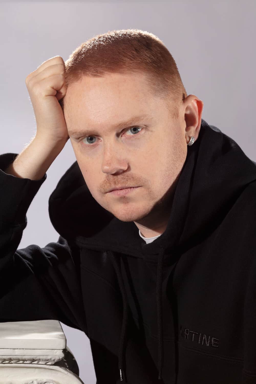
Patrik Sandberg (Courtesy)
Tell me more about the new CR logo!
[That] was a much longer process because the CR signature had been so strong. That’s the visual impression, the calling card of the magazine. If you’re going to change it, it has to be something that will equally imprint upon people and also not lose any of the style and attitude of the original logo. We had some very interesting options and this was at first not the first choice. But then we kept coming back to it over and over again. We really screwed with it over the period of a few months. But then it ended up reverting back to its original first version, which is often what happens. What I think is very interesting about Aaron’s design work in general is that it has this very uncanny feeling, where it’s nostalgic and slightly vintage, but it also feels new. That’s a really hard quality that’s hard to find.
So many brands right now are changing their logos to be sans serif, very sleek faces that all look the same…
The digitalization of image making is part of why so many brands are stripping away their more fanciful logos. Everyone is looking at everything on their phone, so in order for something to be instantly recognizable it has to be able to reduce down to a very small size. That’s valid but it’s also a bad excuse for making everything too banal. The original YSL logo, for example, is still incredibly classic and beautiful and iconic. It shows up just as well on Instagram as it does on a giant billboard. What I really like about Hedi [Slimane’s] rebrand of Saint Laurent was that he updated it and it did feel classic in a sense. The YSL logo is still there. It’s still being used. It just isn’t being used in the same way. We feel that way about the CR signature. We’re not getting rid of it. It [still] might pop up here and there depending on what we want to do.
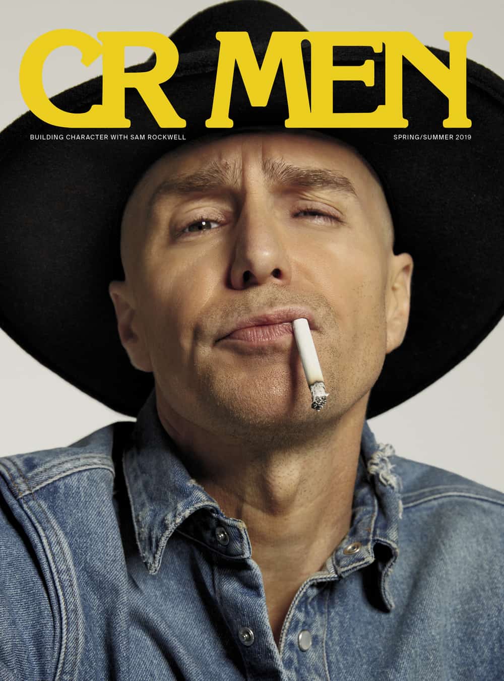
(CR Men, Roe Ethridge)
Take me back to your conversations with Carine — what updates did you want to make to the magazine itself?
Everything [I pitched] was very colorful and bright. It was also a lot about photographers because I feel like there’s been so many shifts and ideas of masculinity. I was looking at people who shape how we see men in a really interesting way. I made her a big visual PDF, and that was what she responded to. I had abstract references in there. I was referencing old Matt Groening comic strips of Life is Hell. It was having fun and I don’t think that that was quite coming through before.
Who are some of the photographers you worked with for the new issues of CR and CR Men?
In CR we worked with Torbjørn Rødland who’s based in Southern California. He has a really interesting point of view. Almost a perverse kind of [way of] poking fun at things. You see that with Roe Ethridge’s photography, which is why we’re so drawn to Roe to shoot these covers. Chris Maggio is another photographer that we’re loving. Toro I think are going to be very important photographers. They are David [Toro] and Solomon [Chase], who are members of Dis, the art collective. They create these amazing mis-en-scene like setups. They did a shoot for CR Men that’s about objectifying men. It proposes that men should be sexually harassed by women. It’s photos of men walking down the street and women in cars whistling at them. It’s very funny. Eloise Perry is a British photographer who I really connected with. She went to Atlanta [to shoot Bradford Cox of Deerhunter], and then we also sent her to Thailand to shoot a transgender Thai fighter named Rose Baan Charoensuk.
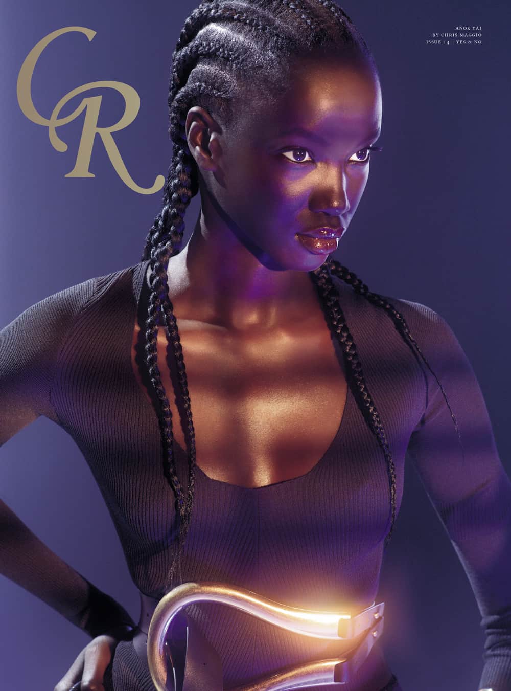
(CR Fashion Book, Chris Maggio)
What magazines did you gravitate towards when you were growing up?
I was obsessed with Vanity Fair probably from the age of ten. Of course I got into i-D. I was a subscriber of Spin Magazine. Spin, when I was younger, was a very cool magazine. It had Hole, No Doubt, The Smashing Pumpkins, and The Cure on the covers. I’ve had a love/hate relationship with Rolling Stone. I would buy it whenever I felt it was a very significant cover. I remember when Seinfeld ended, they came out with an issue that had George, Elaine, Jerry, and Kramer dressed up as The Wizard of Oz on the cover. I think I still have that magazine somewhere in my mom’s garage or something. What all of these magazines had in common was very bold pop imagery, but also they were cultural and interesting and they were about music and movies and fashion. I’m still the same way.
How does the fashion industry itself influence editorial decisions?
When I was editing V Man, it felt at that time like fashion was very much about either being very classic with a lot of suiting or it was about being very edgy. The thing about V Man for me was featuring really cool and interesting men because we knew there wasn’t too much that we could push in the world of fashion. Now that has completely changed. Men’s fashion is much more opulent. It’s much more outrageous. Much more feminine at times. There’s a lot of humor in it and I felt for a men’s magazine to be interesting and relevant, it needs to have a sense of humor. A lot of the men’s magazines that have folded, you can see why. It’s because it was a little bit too preppy and a little too boring. I wanted to make a non-boring magazine.
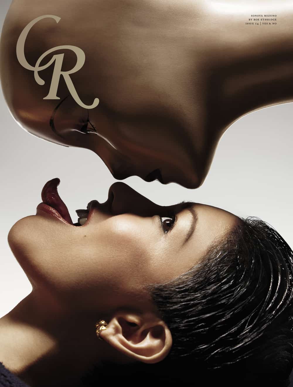
(CR Fashion Book, Roe Ethridge)
Kim Jones’ debut at Dior was your jumping off point for Men this season. What was it about the collection that inspired you?
[It] felt like a big breakthrough for his first season at Dior. I feel like Kim Jones was taking his incredible stature in menswear as this shepherd of youth culture, and person who is so influential to so many streetwear designers and fashion collectors and young people. He was looking to guide them and he was moving things in a direction where it’s about presenting yourself in a really civil, dignified way. Not trying too hard, or capitalizing off of any trends. It really felt new and that got my wheels turning because I was thinking about how everything is so chaotic and unpredictable right now. The thing about having this very together man was suddenly very attractive. That became the M.O. of the whole issue.
That’s really interesting!
In fashion, people are always interested in who is the newest, youngest star or the newest musician. Everything has to be new, new, new. If you’re an older, more accomplished person, no one really seems to be interested in you unless you’re on death’s door. Kim’s Dior collection was directional in terms of aspiration. When I think about aspiration, I think about men who are in their forties. Women as well. When you’re in your forties, you’re at the peak of your career. You’re in your prime. I wanted to feature people who are really accomplished and really talented who have earned respect.

(CR Fashion Book, Chris Maggio)
Who are some other designers who have your attention right now?
There’s a designer named Xander Zhou who is incredibly interesting and underrated. I really love GmbH, I thought their show was really inspiring. I think what’s happening at Marni is fascinating and I look forward to it every season. It’s one of the shows I get most excited about. And then there are the people that are constantly doing strong work. Craig Green continues to be very important. I thought Hedi’s Celine show was incredible. I loved it. The internet went off about it. There’s these prescribed narratives of people who are in or who are out, and I don’t really agree with it. I like to make up my own mind, and the Celine show really felt like…it really dazzled me.
Do you have any opinions of who should take over at Calvin Klein?
I think Telfar should do it. He’s the most exciting American designer right now. There’s a giant movement around him. He’s also built his entire business on sportswear basics and changing them in ways that are interesting without making them too elitist or too high fashion. He’s had a lot of experience in underwear. There’s a lot to him that matches up with Calvin to me. And it would be wonderful for them to appoint an American designer — especially an American who’s also African. He’s Liberian-American. But if they do it, I’m sure I won’t get credit for that idea.
I’ll make sure you get credit.
Telfar, Telfar, Telfar.
Subscribe to our newsletter and follow us on Facebook and Instagram to stay up to date on all the latest fashion news and juicy industry gossip.
1 comment
The R in CR immediately made me think of Rollingstone magazine, so I don’t like that but, one gets used to it.