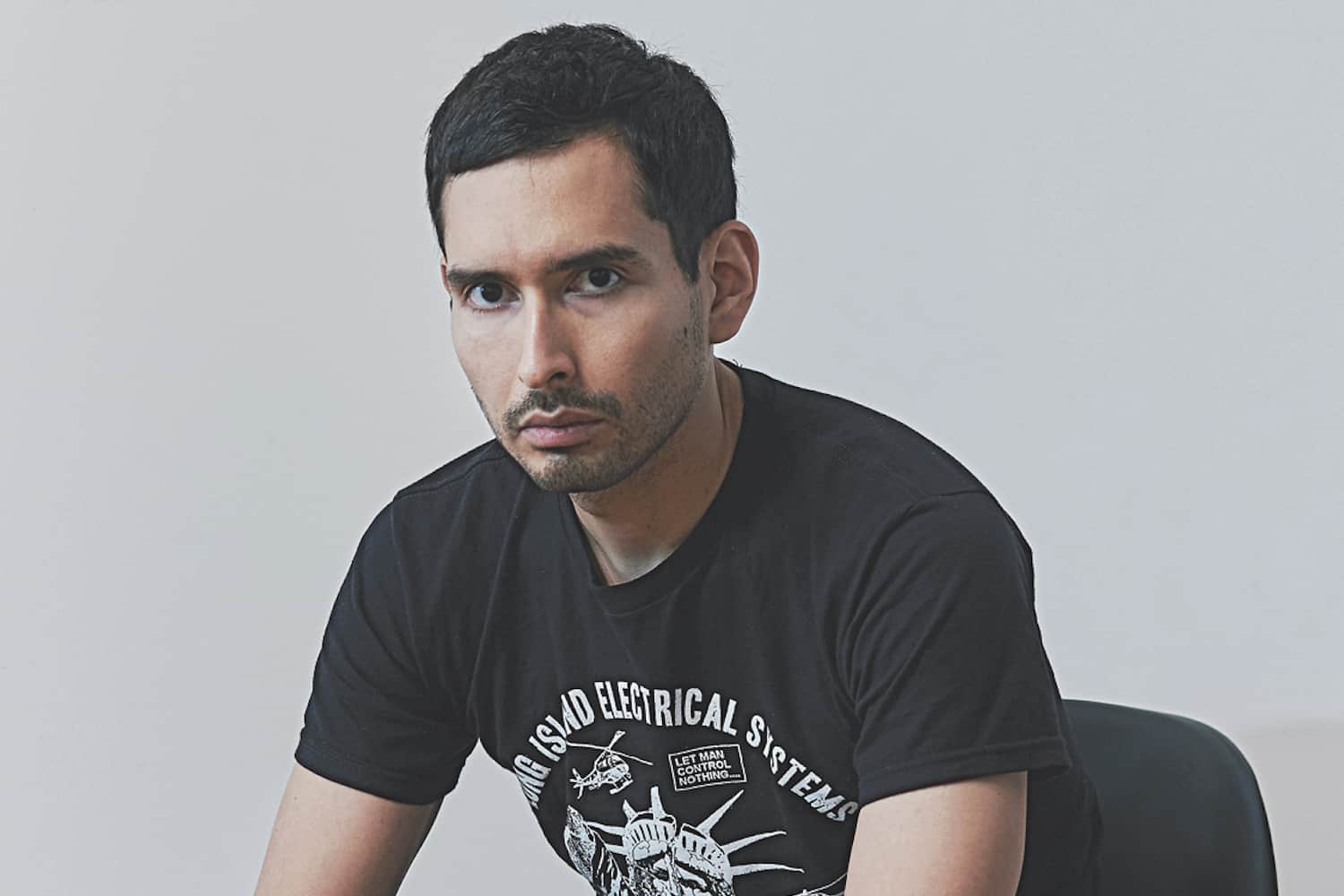
Rob Vargas had daunting shoes to fill when he nabbed the design director spot at GQ this spring. His predecessor, the legendary Fred Woodward, spent more than 15 years at the Condé glossy. Vargas has been subtly reenvisioning how a men’s mag can, and should, look in 2018 — and boy, is it brilliant.
Give us your backstory — how did you end up at GQ?
When I first became interested in magazines, fashion titles in particular were a big draw for me. My first job was in the art department at Details. After that, I followed opportunities that led me to different places, and I ended up at Bloomberg Businessweek. I really loved it. We were able to be creative within the context, but it had certain constraints. The subject matter was CEOs, bankers, hedge funders, start-ups founders. The opportunity to work for GQ was a chance to go back to where I started, to why I was originally interested in magazines.
What was your creative MO at Businessweek?
The magazine’s founding creative director, Richard Turley, was there when I started as an art director. He began developing a visual language to address drier content: very experimental with design, very loud with the typography, very loose with the photography. I’d see other magazines investing so much money and time into producing meticulous, beautiful imagery. There are other rules at other magazines, where you can’t do certain things with the image: You can’t crop, put type over it, it can only run at a certain scale. But we were shooting from the hip; we were a little less precious. [Our layouts] weren’t the results of highly produced, polished shoots! We were basically designing with very few goals. The opportunity to do that doesn’t happen often, if at all. After Richard left, I inherited his role, and I wanted to preserve that spirit of experimentation and creativity.
It was indeed a brilliant era for the publication. What shifted?
Eventually, there were some changes in management and they felt that perhaps the aesthetic went too far, or maybe it wasn’t completely understood by the magazine’s core audience. The design community definitely appreciated what we were doing, but there isn’t a ton of overlap between the design community and the finance industry. We shifted to a more refined look, which I think has been working well. But it was purposeful — at a certain point, we had to pull back.

October 2018’s cover (GQ)
Were you bummed that the higher-ups toned things down?
I definitely was a little bit. Not all changes are immediately greeted with utter enthusiasm. But you always have to think of change as an opportunity to do something different, in a great way; I was lucky to have a staff that felt the same way. This happened a couple years ago, shortly after the election, and definitely all playfulness and irreverence we had pre-2017 shifted into a different type of mood, especially in the news cycle, so the timing [for a redesign] was pretty good. At a certain point, you start to feel a little self-conscious if you’re cracking jokes with the news when the world is falling apart. A more serious tone definitely felt appropriate on a conceptual level. It was an opportunity to do our version of a clean, elegant design.
Any favorite covers you designed at Businessweek?
There were so many! The philosophy a lot of times was, “Let’s just do whatever the dumbest idea is.” And it always ended up being kind of hilarious. For [a cover story about] the bear market, we put literally, like, 50 bears on the cover, with no text on it, and there was one bear that had his paw up, and on his paw was the article’s page number. That was pretty insane. Any sort of newsstand or magazine expert will tell you that running a cover full of bears with zero cover lines is probably the worst thing you could possibly do, which is probably why I loved it so much.
Did you gain a mini-MBA during your tenure there?
Weirdly, no. Obviously, I read a lot of the stories we had to think of [layout] ideas for, and I learned a ton. Stories that connected with me crossed the line between business and personal interest — pretty heart-wrenching pieces about how certain industries affect people around the world. Businessweek was one of the few places to get that type of content. But in terms of the nuts-and-bolts, stock market–type of content we also ran? I managed to absorb none of that, somehow. After eight years, I could not tell you how to invest anything.
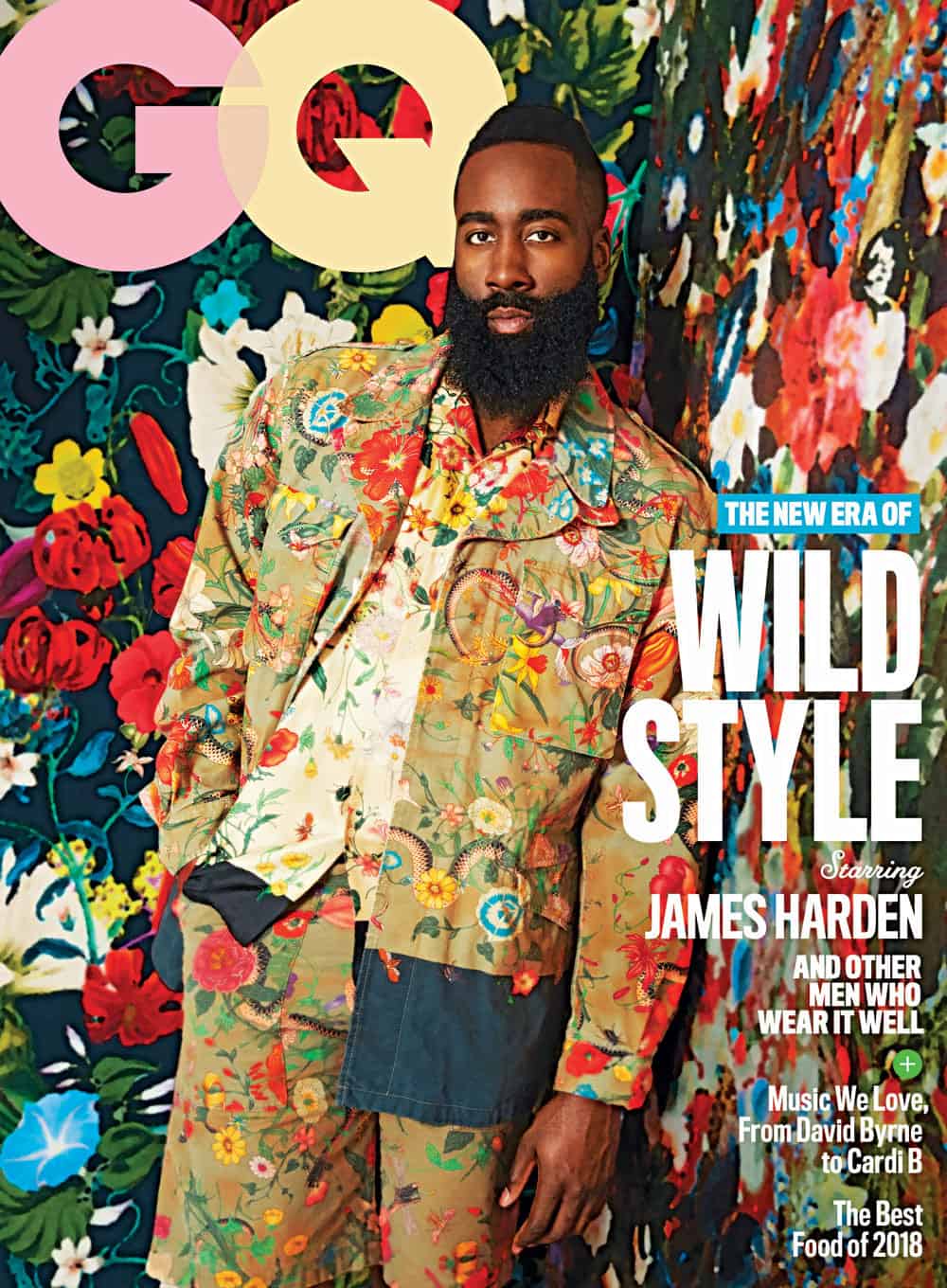
May 2018’s cover (GQ)
Do you miss the bountiful snack selection at Bloomberg HQ? It’s pretty epic.
How can you not? It’s like Willy Wonka on the sixth floor there. But you know, I’ve weaned myself off.
The cafeteria’s not too shabby at Condé, either. What was it like when you arrived at GQ?
As a designer, inheriting Fred Woodward’s job is probably the most terrible thing ever, because the expectation is sky-high! To me, there will be no better magazine designer, ever. So I had to force myself to ignore [my predecessor] in order to get through my first two months here. [EIC] Jim Nelson, [creative director] Will Welch, and I discussed: How do we take tried-and-true GQ formulas and evolve them? GQ has had a distinct identity for the past decade, at least, but, in a similar way to Businessweek, there are now conversations around masculinity and vulnerabilities. How does a magazine like GQ — which, in cliché, is jumping, smiling men in suits — evolve that aesthetic to respond to a changing culture?
Did you hit up Fred for any advice?
No! I was honestly so intimidated by the guy. I met him once, and he was the nicest person to me, ever. But I still feel so unworthy! My personal hope is that he’s on an island somewhere vacationing and is not even aware I’m here, because I would feel kind of bad if he did.
What’s your favorite GQ cover you’ve designed to date?
Our June Comedy Issue cover, with Sarah Silverman, Kate McKinnon, and Issa Rae, was probably the most difficult to pull off. It was a work-intensive process, but I have a lot of good memories of working on it. A) It’s hard to get three people in a room; and B) if you can get three of them in a room, it’s still hard to Photoshop that together in a believable way; and C) it’s hard to Photoshop in a believable way, but then to reverse-Photoshop on top of it. So the photo director at the time, Michael Allin, and I went through a bunch of selects to marry the right images, and then we played Photoshop tennis. He would give me a file with five arms and three legs; I’d take an arm away and add another leg, turn the leg and something another way, pass it back to him. We were going back and forth to make sure we created a funny cover, not a terrifying cover. Certain versions were definitely insane-looking.
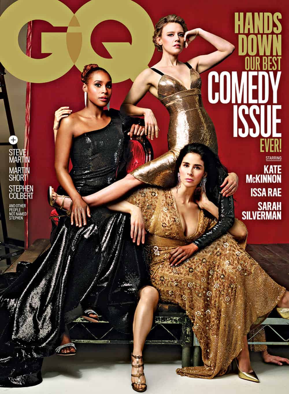
June 2018, the Comedy Issue (GQ)
Any others you really love?
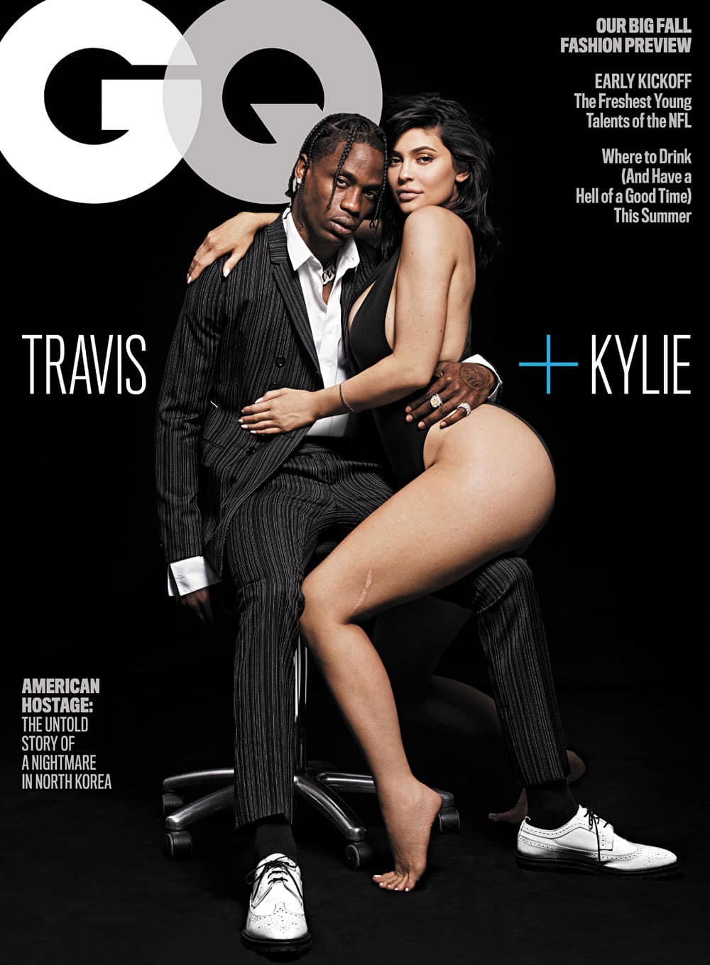
I think the Kylie [Jenner] and Travis [Scott] cover was strong in its own way; it’s so clean and stark. I just loved that we were able to not run a lot of type on that. I’m most excited to create imagery that feels surprising. Coming from a designer, it’s a weird thing to say, but I’m always a fan of a cover without a lot of type. When an image is really strong, you don’t need to say a lot. I hope we can keep pushing how we represent men at GQ. We’re already beginning to touch upon that. The James Harden cover from May, the first cover I worked on when I got here, presented a basketball star in head-to-toe florals, with a floral backdrop. You never would’ve seen that a few years ago.
Before Businessweek, you worked at T and The New York Times Magazine…
I learned how to do classically beautiful design, and they have insanely high standards. I would have to spend hours on things that, at another magazine, you don’t consider for longer than 15 minutes. I learned a level of discipline I hadn’t been exposed to previously. In the end, that isn’t necessarily the environment I personally thrive in, but it was incredible to be exposed to it.
(GQ)
You’re also an alum of New York mag.
It was also very intense. It was my second job, and my first experience at a weekly. In a lot of ways, it prepared me for Businessweek. When I got to New York, I wondered, “How do they produce this much quality content in a week?” I just did not understand how it happened. Basically, nobody ever stopped working. That was my experience as well. The first time I ever worked for 24 hours straight was at New York, on a four- or six-page infographic that was particularly detailed. Yeah, it was super intense, but I loved it there! I loved the people, and I’ve always loved the content.
Do you ever get the design equivalent of writer’s block?
Oh, for sure! If I’m stuck on something, I just bring it to the group; I really got used to a level of collaboration at Businessweek, and I’ve tried to bring that over to GQ. Hierarchy isn’t really important to me. I’m always asking for my art colleagues’ opinions, and offering my opinions, so it’s a two-way conversation. Or I’ll go on Instagram — it’s what Tumblr used to be for designers. I basically just go into holes, bookmarking photographers. I’ll do short but intense spurts in an Uber, on the train, walking to grab a salad… Once I get to the office, there just isn’t time to poke around.
What would you be doing career-wise if you weren’t designing?
Oh man, I would definitely be in Miami, in the hospitality business. Possibly working for Ian Schrager.
Subscribe to our newsletter and follow us on Facebook and Instagram to stay up to date on all the latest fashion news and juicy industry gossip.