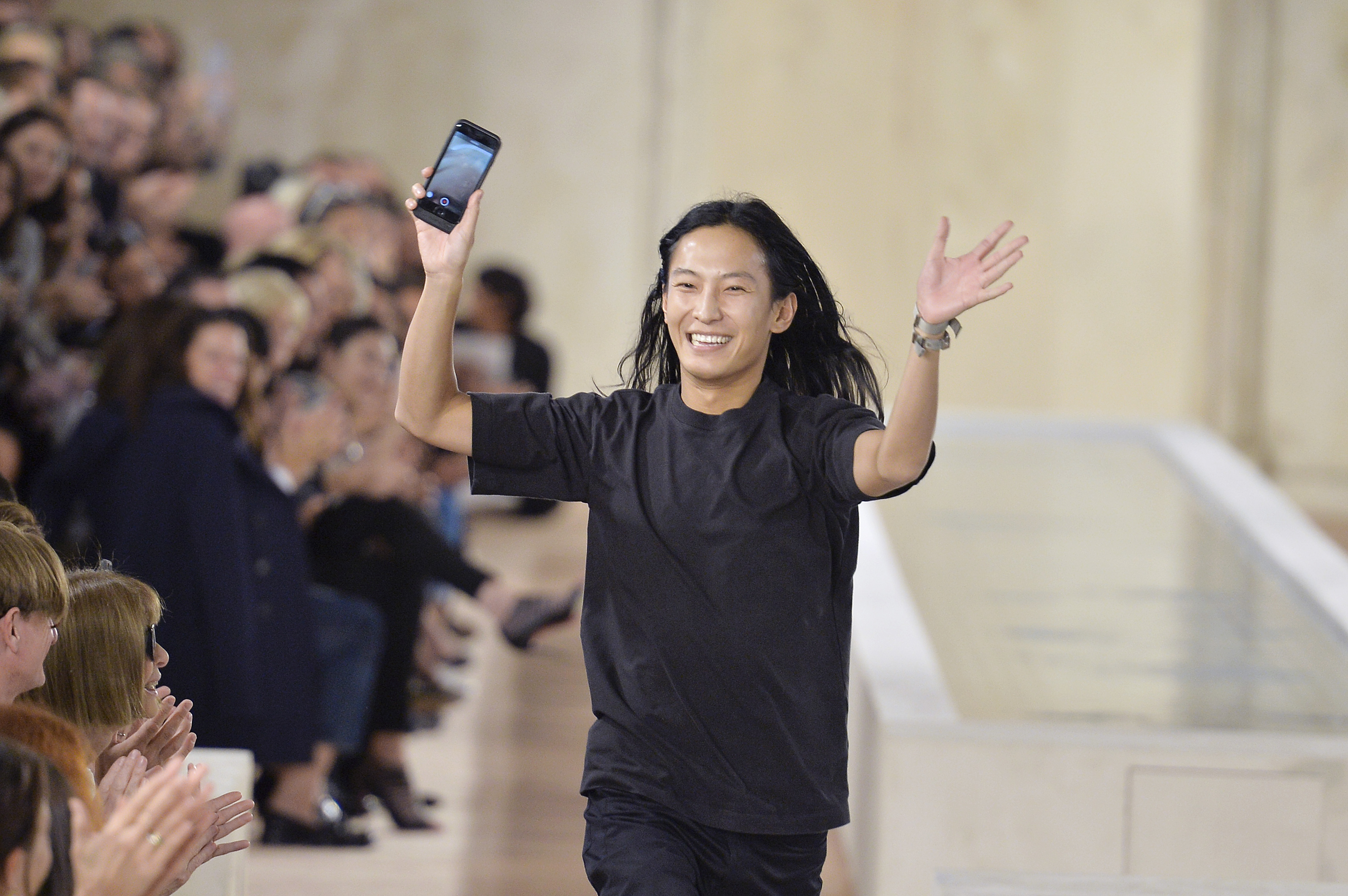
Alexander Wang— both the man and the brand — sits at the cutting edge of cool. That means every so often, he’s inclined to shake things up, as he recently did with his logo. Videos on Instagram show that what once was all black, caps-locked, and two dimensional is now a sleek, lowercase rendition, with hints that the lowercase “a” might be a spotlight for the new look. Though the Instagram posts all dropped this past weekend, as Hypebae pointed out the new look was actually quietly unveiled through the Uniqlo x Alexander Wang Heattech collection.
The fashion industry has seen a handful of logo changes in the past few moths. Riccardo Tisci re-vamped the classic Burberry logo, ridding it of the knight and very British font, and opted for a sleek and simple look instead. He also introduced a brand new all-over monogram with Thomas Burberry’s initials, which quickly took the internet by storm. Meanwhile Hedi Slimane made a less drastic (yet highly controversial) change when he reverted the Celine logo to that of the 1960s, removing the accent over the first “e.”
Though logo changes appear to be all the rage, it’s important to note that while Tisci and Slimane were stepping into roles previously held by other designers, Wang has made the change to his own brand. It’s never too early to modernize!
Subscribe to our newsletter and follow us on Facebook and Instagram to stay up to date on all the latest fashion news and juicy industry gossip.